yep, completely agree. Renault have had a string of terrible liveries since they won the championship – last years was the exception to the rule. Now back to this, which is terrible.
The gold is a horrible colour and the lines are too thick!
Completely agree about the thick line a. I really loike this livery, then after I saw the Team Lotus livery that you linked to, 30 seconds looking at that makes this one look like a marker pen and ruler job.
Hah! Funny, but honestly the majority of F1 viewers will never see it in person, so who cares. What’s important is how it looks on TV. The basic livery doesn’t bother me, even the overly thick gold lines. What I find unappealing is the red… but I have to say after seeing the whole car and all the team gear, I’m softening to it a bit and think I could grow to like it over time. It’s kind of the colors of Germany, http://de.wikipedia.org/wiki/Schwarz-Rot-Gold
I don’t think the basic car is too bad actually. I just wish they didn’t needlessly dredge up an old liverly without having a sponsor that fits it. The livery is bad, with the gold too thick, the red looking ridiculous and the lotus badge being over-large, but I think the car underneath looks quite good. I prefer it to the Ferrari.
Its ugly only because of the red endplates that don’t match the rest of the livery. If the endplates were white with complimentary lettering then I think it would be pretty bad@$$ looking
Well i have noticed on a youtube video that the R31 has got a different front wing to the rest by having two blades sticking upright rather then sideways which is indeed different.
Actually just go to the offcial f1 website they have a picture of the front wing and it is indeed a blade, and it has got a few more extras which you cant really see on the video.
Apparently it has no exhaust outlets to be seen at the rear of the car. Some reports suggest that the exhaust gases are directed towards the front of the car and blown over a sort of front diffuser. Maybe this could be the innovative and aggressive design feature Renault kept referring to.
looks like Renault is playing hide and seek. They have shown us an old car and a render of the livery in November, the old car a couple of weeks ago, now they show the definite livery on a new but not complete car.
But from what Scarbs writes on that car it is exiting as they might well have done someting new, if they actually make it work.
Keith (or anyone with the skills) that you can put up split front end comparison against all the cars as they launch… so we can look at half a Ferrari against half a Renault or Virgin and Lotus and so on and so forth? I know it probably takes a lot of time, but it would be cool to view the differences in a split screen format.
Looking nice, but not that revolutionary as I was hyped. There are quite meaningful changes mainly on front part, which aren’t so obvious at a first glance.
If the exhaust does turn out to exit in front of the sidepods to feed airflow under the floor, then I would call that revolutionary whether or not it works.
Black and gold on a car with all the right curves in all the right places? It’s a damn sight better than Sauber’s grade-school effort, or Lotus’ inability to make the background of sponsor decals appear the same colour as the rest of the car.
I think a lot of people are just opposed to it because they don’t like Dany Bahar.
Nope, Team Lotus is. That giant yellow streak on the rear of their engine cowling goes against the lines of the car. It’s like cutting a piece of wood across the grain.
Team Lotus doesn’t look that bad, infact it has a unique and original colour scheme that actually works. The Lotus Renault on the other hand is has a couple of fat ugly gold lines running in random places on the car, and the Red Total end plates and side view mirrors make me wanna throw up.
Haha! This is getting to be fun to read! Fight, fight, fight, fight! My Lotus is awesome and your Lotus is terrible! No, your Renault is terrible and my Lotus is awesome! Can we all just agree that the Sauber is the worst? PM hit the nail on the head, grade school effort.
@PM, I think you’ll see the final painted Lotus will look better than the early shots where the logos are clearly stickers, and it’s impossible to match a color exactly between a sticker and a paint. As far as the yellow bit at the back I don’t know what you’re on about, I think it’s the best part and a big improvement over last year’s livery.
I’m opposed to Dany Bahar because I don’t like Dany Bahar.
I’m under whelmed by this because it should have been so much more. And there has been so much stuff about Group Lotus that everyone knew what this was going to look like anyway…
I actually think the Sauber is quite good when it appears on the track, I do not find it an eyesore at all. This, with the jarring red and white on ‘black’ and gold is just ridiculous in comparison.
And no, alot of people dont like dany Bahar. Which I think makes then a better judge of many things, who knows, maybe liveries amongst them ;)
You’re right – this is aweosme looking. While some people complain about the fat lines, I don’t think the slim lines on Senna’s John Player Lotus would work on the current architecture or design of F1 cars. It may not be catchy and so I think the fat lines are great. The view from the top is most splendid, with the sponsor logos adding to the effect! But I did like the Team Lotus livery too – two represenations of Chapman’s dream?
I figure the Fernandes-Bahar issue could be clouding the minds of many. Anything Renault or Group Lotus does is horrid, preposterous, ugly, stupid and irritating for them, while anything Team Lotus does is awesome, glorious, beautiful, pioneering and the best thing to happen to Formula 1!
I figure the Fernandes-Bahar issue could be clouding the minds of many.
Agreed. I really like the Team Lotus livery, and I’m about 90% behind this livery mainly just because I miss last year’s bumblebee livery and I can’t get too excited about the red bits. They’re both a lot better than most of the liveries on the grid though in my opinion.
The curves are nice, the paint-job looks awful… hideous in fact, the gold stripes are big no-no, it’s far too cluttered. And as for the red bits… :s But we’ll see how it looks on TV, unfair to judge when colours and form designed for movement and daylit video are seen statically under a mix of light temperatures
Has any one else noticed the floor? Is that normal, looks like a double diffuser upside Down. And seems to run around the outside of the side pods to the rear wheels
Yeah, it’s really really pretty, I actually love the red, I think it contrasts from the black in a very striking manner.
An there are so many facinaiting things on that car, doubtless to be copied, outwashes for the rear tyres being one, WHERE ARE THE EXHAUSTS being another. So many details, I have found my first pet favourite of the 2011 season. Lotus gets a meh, the Ferrari is a little bit scary, Merc looks someone’s thrown a platypus at a wall of aluminium.
But the Renault?
What. A. Beauty. Even the Lotus badge looks good. Gets a freakin A.
If you look at the Team Lotus version they would have run, this one get more ugly by the second, kinda looks like they let someones wife loose with a ruler and a gold marker pen :)
If you look at the Team Lotus version they would have run, this one get more ugly by the second, kinda looks like they let someones wife loose with a ruler and a gold marker pen :)
Seriously, look at this car for at least 30 seconds, then look at the Lotus Renault…. Then think, if they were girls, which one would you rather kiss. Elegance wins every time over bulky lines and red blotches.
Well I did it an I’d still rather kiss my girlfriend, that’s allowed right?
I prefer the Lotus Renault version because it’s on a real car, I also quite like the Red despite the hate it’s getting. Adds the modern element to the retro livery.
(Your kinda right, Teams design was good, but you know, I like them in green.)
I don’t understand all the hate either, I think it looks fantastic! You do wonder whether the Team vs Group debate is colouring people’s judgements, it’s somehow unacceptable to think both the Lotus and the Renault look great, as I do!
*sarcasm*Nice livery, I’m gonna start smoking now. *sarcasm* Their diffuser seems bigger than Ferrari’s. Front nose seems lower than other cars as well.
Rear packaging is kinda interesting, instead of the sharp cutaway pionered by RB last year an taken up by Ferrari and Lotus this year, it slopes down to flat very quickly, providing space in a different manner.
McLaren did something simular when they introduced their EBD but only got it working very late in the season.
I’m also warming to it, the extra sponsor logos on this version help it a lot. I just wish Total were not so stubborn and they could remove those red areas.
I actually thought that relatively to the other 2011 cars we saw, the nose is rather short and the back seems long.
The sidepods seem rather narrow but also without a huge undercut, and quite long, and relatively high at the back. The Ferrari and Sauber actually seem a lot narrower between the rear wheels. The RB6 seemed to be about the same as the R31 is without double diffuser, to me.
Do you have pictures other than these three to base the “tiny”on?
ive got a funny feeling ferrari have got it right though. look how tight the back end is, compared to the others which are quite bulky. That was the trick of the rb6, how they managed to taper the rear end to a near point, and i just think ferrari look to have done it even better. Obviously i can only speculate and it could be a dog, but it just looks right
Having seen more of the R31 pics, I think they have tried to really make it slope gently down all the way to the diffuser at the end of the car. Quite a different concept, and possibly less draggy (don’t know that, no), but you could be right that the RB6/F150 way is better. We’ll see :)
Yeah, for a faux-Renault by way of Luxembourg, a faux-Lotus by way of a Malaysian sticker shop, a faux JPS paintjob, and a busload of faux test-drivers; I agree, faux-cyrilic would certainly be quite apposite.
Uh, Petrov won’t be replaced unless he falls short of the performance clause in his contract. It’s not like the other drivers are constantly bidding for his seat.
Unfortunately, even if Petrov falls short on his performance clause, they will keep him for the money. I’m sure his performance clause states that he should get only 20% of his teammate’s point tally to keep his seat.
Senna just said in his twitter account that he is first reserve or ‘3rd driver’ at every race and test and have a test program in the old car. Awesome!
Oh, it’s all the tiny little things. The R31 is much more curvaceous than the other cars that have been launched. The V-channel on the nose starts much further down the car than one any other. The rear of the engine cowling is higher than the airbox. There’s a little flare around the skirt at the bottom near the vertical upright. The bodywork goes much further back than on the other cars, and they opted for a high, tapering rear end for the engine cowling.
I agree that it is an interesting car, and very different from other 2011 cars, just as the R30 was very different in concept to the other 2010 cars – this could well be an evolution of that car indeed, but then slimmed down at the back and smoothed and made sleeker.
Still doesn’t mean I like the livery or Group Lotus dealings with the team.
I’m just interested in seeing clearer pictures of the development in the splitter area. It looks like the keel has some additional aero development in that area to further condition the airflow under and around the sidepods.
From pictures looks like it is most innovative design from the cars that had been launched. Hope is fast enough to be able to fight for wins not only podiums.
I will say it has the best looking wheels of any car launched thus far, and by a mile! They make me think of the Tim Burton Batmobile, all the gold on black. And yes, I imagine Total is going to get some negative press for keeping the red on the car, but it will make it easy to spot!
Evolutionary, but I like it, it looks longer than everything else we’ve seen so far.
And though I know it’s all for aerodynamics, I hate the hunch back look, all the cars would look better if the airbox sloped down gracefully to the back end as beauty should mandate!
So let me get this straight, this F1 “team” is sponsored by 3 car companies…
Renault (which seems to have the prime advertising space) Lotus and Lada. That seems more than a bit absurd.
Also the fact that Genii have taken to plastering their own logo (when they don’t actually have anything to sell, and therefore no need to build a brand) suggests a lack of sponsorship dollars….
It seems funny to me that all this Lotus controversy was created so that Group Lotus shares advertising space with Lada… Still, I want this car to be a front-runner. It is going to be hilarious to have a “Lada” showing the way to a Ferrari or a Mercedes!
Lada is playing in low-cost niche, while Renault is selling more expensive cars. The only exception is Logan. But still it’s slightly more expensive then Lada’s cars.
Hmm, can’t say I share the enthusiastic response here so far – it’s not ugly, but I can’t say it’s very good looking either…. it’s very busy isn’t it? then again, I suppose we can only rejoice they have so many sponsors; it’s harder to come up with a streamlined livery when you have a dozen or more names to fit in. The chassis itself seems to have some very nice flowing lines to it though.
I got kicked off the web site for the live video stream. Apparently the server was very busy. :-( However, I have to say that car looks hot. (And I’m very happy to see Bruno Senna there!)
I’ve just looked at all the cars’ wheels. Seems like Ferrari are the only team to have different front tyres than the back ones. Might help them in pit stops?
At least the other Lotus Renault and Red Bull. Mercedes might also I think, and Torro Rosso will probably keep it too. I doubt McLaren and thus Force India will – Williams? maybe, and then I suppose HRT will follow. Virgin I have no idea, they might be wise to stay with push rod now they have data on that.
Lotus (last years) Renault RBR (probably)…. ….wouldn’t it be funny if they move away from it, I can’t see it being as much as an advantage as the last two sessions now the diffusers are simpler .
The R31 easily has the best lines of any car so far. Start at the tip of the nose and follow the lines backward – it’s a single, unbroken arc from nose to tail. None of the other cars are nearly as curvy as this.
I agree that the airbox area looks really nice and flowing – those two side inlets (possibly adaptations of the former apparently efficient f-duct inlets) fit in so well that they are hard to spot from the side view.
The back of the car reminds me of the RB6 but maybe a bit smoother flowing (since it doesn’t need the exhausts to be able to be “secretly” moved down).
I don’t like, no wait I don’t like it at all. I never liked and understood the whole idea of bringing Lotus back into the F1 although I was impressed with the work from the other Lotus. I always loved Renault in the F1 because Renault wasn’t making sportcars but just normal cars.
I just don’t think that any sponsor on the car is taking benefit from this stupid livery, business move, idea etc. This silly Lotus Lada Renault, come up with something new! John Player did not pay a penny for this free advertisement
How many F1 test drivers does it take to change a light bulb?
I don’t have an answer to that, but that line-up of four does raise questions. Like in what way will they be able to test, and will any of them get to actually drive?
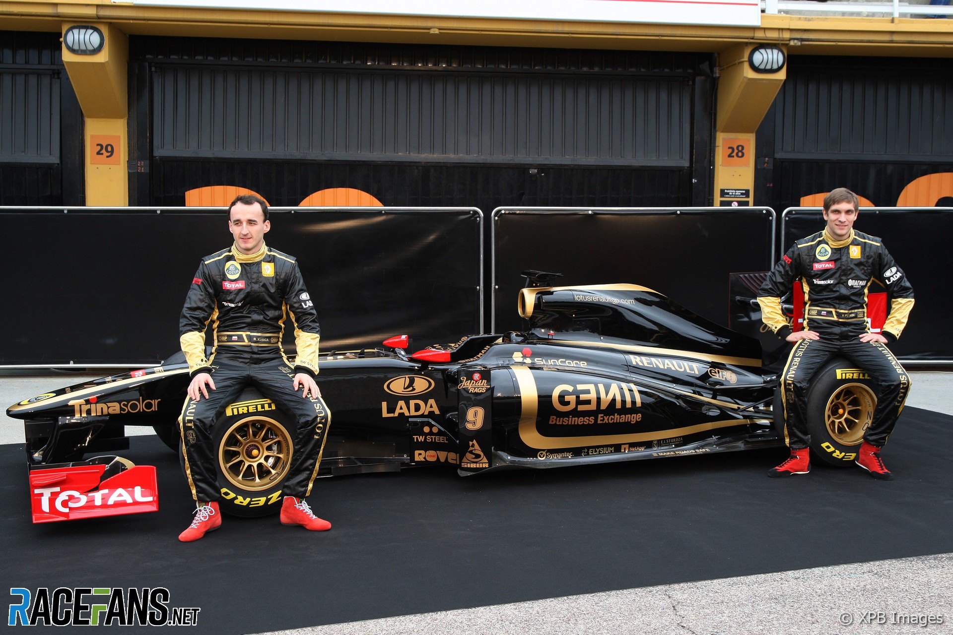
Two random observations: I love the expressions on Senna’s and Grosjean’s faces – they seem to like the looks of the car! And: the red endplates don’t look too bad, but Kubica’s little red booties sure are a little funny.
I thought they both were delighted to have a gotten/regained/kept a place in F1, even if not as a racing driver, at least with potential to get to see the wheel of an F1 car. I bet they wouldn’t mind Petrov messing up :-p
The lower nose looks nice. I didn’t expect to see it on any car this year, since noses of all new contenders so far have been raised even higher than last year…
Has any one else noticed the floor, is that normal with all the sculpturing on top that seems to run round the outside of the side pods and up to the back wheels
The Sauber follows the Ferrari in being tight too – but instead of going very low like Ferrari, they seem to have gone for high and narrow.
Is the Lotus really a lot shorter – the nose looks much more blunted than the others. Of course it is just above the Sauber with the still considerable overbite, but the other cars do seem to have the front wing noticeably further back from the tip of the nose. May be the angle and it being a rendering instead of a photo.
The Renault seems not much shorter, but its sidepods do seem to start “earlier”.
where are those pictures? Oh, launch gallery – yes the front wing looks interesting from that angle – the end plate clearly has become smaller now that it doesn’t contain a flap mover, I think.
By the way, the nose looks very flat on top, partly thanks to the golden band around it, and the Lotus logo is still being BIG about it.
Ahh.. so that’s one of the radical/aggressive bits they were referring to. Not a surprise given the rate at which they were developing their front wing last season, but wasn’t as visible in the side profile pictures.
I quite like it to be honest. Didn’t like the livery release at the end of last year..not as refined and perhaps the ongoing saga swayed my opinion. The red at least gives it a more ‘contemporary’ feel. Nice to see Bruno is number 1 reserve too.
According to Steve Hopkinson’s blog, there isn’t an exhaust outlet to be seen anywhere. Rumour is that they are at the front and are blown over a type of front diffuser.
just for the sake of being difficult, apparently thats not fairuz fauzy, its Ho Pin Tung. i know how much people like things to be correct and all that.
The livery looks much better on this than on the R30, definitely! The red in those pictures also looks better than I believed it would.
Also I don’t see what the fuss is about regarding it’s apparant ‘ugliness’. The shape, at least, is much sleeker than the obese R28, 29 and 30. But I’ll agree Team Lotus have pulled out all the stops when you compare the two launches.
That red color kills it completly; it was already out of place on R30, but you could accept it with yellow, this time it’s… worse; it makes those red parts stand out too much – looks like a woman with elephants legs.
I suppose that they could give Total back its sponsorship money, and then the car would look better. Yeah! That’ll work! Why didn’t they think of that before?
There are rumours that the Renault has a highly innovative exhaust system.
Apparently, rather the exiting at the rear of the car, it exits below the car much nearer the front and feeds a front diffuser to provide more downforce…
the front tray just under where the driver sits. to me there seems to be alot more going on compared to other cars i have see so far. i could be wrong though..
:( There are no planes of the front wing, but in 3:19 you can see “kers” on the steering wheel and in 3:22 looks like you can see through two halves of the rear wing, altough it may be a optical illusion (illusion, never better used)
Rumor of a Front Exhaust Blown Diffusor are really heating up now as there are no exhausts on the back, so technically they could have led the pipes to the front to blow the “front diffuser” (Teatray portion?)
I’m a bit confused as to why Renault said the design was ‘at the brave end of brave’. To me it looks like the most conservative of all the cars launched so far.
Wow you guys on here are really really sad and just disrespectful,this is legendary not dissapointing you’re basically judging the car by looks not Performance(which matters in F1 and in any other Motorsport Category)Lets see Pre-season testing if the car looks pretty good,im confident it is and with their recovery last year after Alonso left the team and Crashgate happened,They did a brilliant job with Robert,Vitaly made several mistakes but will do Russia proud this year and learn from his mistakes and become stronger as well as Bruno doing his late uncle proud and his country with himself still being involved in F1.Good luck to Renault this season i really hope for the best for them this season.
christ, didnt you read the small print?- no insults allowed. Freedom of speech mate, if people want to enjoy themselves with a bit of harmless speculation then just let them. I don’t think anyone’s really being sad or disrespectful- some people seem to be more clued up than others maybe- but firing off about people being disrespectful’s a bit pot-kettle-black
More than likely, the lower channels of the front splitter direct and accelerate air toward the barge boards to assist in sealing the floor. The upper vent on the splitter is likely to be a cooling duct for the KERS.
Judging from the pictures I’ve seen of the rear of the R31, it is possible that the exhaust exits extremely low over the top of the diffuser through fairly thin openings near the gearbox. As a result, it would be reasonable to assume that the gearbox is exposed to open air in effort to add additional cooling. However, I’m not entirely convinced that this isn’t some silly stunt, and that the only thing odd about the exhaust is that it, and the relevant bodywork, isn’t installed–much like the push rods and track rods being noticeably absent from the front suspension of the Lotus T128.
The more I read about this car the more I feel its going to be the dark-horse of the season, and will hopefully allow Kubica to compete for regular wins. There are some very interesting details in the design.
So, hearing a weird rumour right now: the R31 is said to have an exhaust-blown front diffuser. I’m not entirely sure how that works, but it would be pretty revolutionary if true.
I’m also hearing that the exhaust is concealed under the car somehow.
Am I the only one that likes this? Yes, I agree the Team Lotus approach looks better, but the Renault version is still good. And I think the red endplates look fine on it. it adds some visual interest points to the solid black.
Frankly, I’m glad that for the second year in a row, Renault have done something more interesting and that stands out from the rest of the field. Last year there were way too many cars with predictable, boring lines and solid colors. Not to mention either being on one end of the spectrum or the other: garish or dull. Nothing that visually attracts without full-on attacking the eye. This, if you ask me, is a step in the right direction.
Cheap joke aside, I find it extremely difficult to believe that the R31’s exhaust is routed half a car length to exit in in the front of the tray to drive some magic front diffuser as is being alluded to by some. Not only would it be a nightmare to insulate, but it can’t be very easy to adjust the engine mapping to compensate for the increased back-pressure of longer, twisty exhaust pipes.
How about @ScarbsF1 tweet: Renault #R31: I can confirm the exhaust exits are at the frotn of the sidepods, with an elbow pointing them back http://twitpic.com/3vf0o2
The color combination of Metallic black with dull ‘pink gold’ or ‘copper’ lines is an absolute stunner. I can’t tell if it’s pink gold or copper. I’ve never seen this combination before. I’m amazed. Truly inspiring for me.


Joe Szpara
31st January 2011, 11:39
Dosent look as extreme as i expected :(
RIISE (@riise)
31st January 2011, 11:45
Looks as ugly as I expected.
Macca25
31st January 2011, 12:25
And the winner of the uglyest car 2011 goes to…
sw6569 (@sw6569)
31st January 2011, 12:36
yep, completely agree. Renault have had a string of terrible liveries since they won the championship – last years was the exception to the rule. Now back to this, which is terrible.
The gold is a horrible colour and the lines are too thick!
sw6569 (@sw6569)
31st January 2011, 12:45
Oh, this is what the team lotus effort would have looked like in comparison. Its far superior!
http://twitpic.com/3v36ca/full
[stole the link from ajokay I think]
;379
31st January 2011, 12:49
the lotus version of that scheme looks stunning. so much more elegant
Hare
31st January 2011, 18:56
Completely agree about the thick line a. I really loike this livery, then after I saw the Team Lotus livery that you linked to, 30 seconds looking at that makes this one look like a marker pen and ruler job.
cubejam (@cubejam)
31st January 2011, 19:15
It looks incredible in person mate. You’re completely and utterly wrong. and I am completely and utterly right. It looks great. end.
US_Peter (@us_peter)
31st January 2011, 21:10
Hah! Funny, but honestly the majority of F1 viewers will never see it in person, so who cares. What’s important is how it looks on TV. The basic livery doesn’t bother me, even the overly thick gold lines. What I find unappealing is the red… but I have to say after seeing the whole car and all the team gear, I’m softening to it a bit and think I could grow to like it over time. It’s kind of the colors of Germany, http://de.wikipedia.org/wiki/Schwarz-Rot-Gold
kirk
31st January 2011, 13:04
Team Lotus?
Macca25
31st January 2011, 13:22
The Lotus version is 100% better than the Renault version.
Craig Woollard (@craig-o)
31st January 2011, 13:12
Ugly usually equals fast though…
Todfod (@todfod)
31st January 2011, 13:20
Tell that to the BMW Sauber team, in regards to their 2009 challenger
matt90 (@matt90)
31st January 2011, 16:25
I don’t think the basic car is too bad actually. I just wish they didn’t needlessly dredge up an old liverly without having a sponsor that fits it. The livery is bad, with the gold too thick, the red looking ridiculous and the lotus badge being over-large, but I think the car underneath looks quite good. I prefer it to the Ferrari.
Hare
31st January 2011, 18:47
Completely agree. When you look at the team lotus version, it’s got not glass. Looks more chav than charming.
http://twitpic.com/3v36ca/full
damonsmedley
31st January 2011, 22:36
Renault. But the car itself is absolutely stunning! If you ignore the livery, this is by far the best looking car so far.
Fer no.65 (@fer-no65)
31st January 2011, 13:12
spot on. It’s horrid
DaveBanchero (@mfdb)
31st January 2011, 14:01
The car looks ok, but the red wings and mirrors look absolutely ridiculous…
Becken
31st January 2011, 14:18
Video with the lauch: http://bit.ly/eHgKKy
SeattleChris (@seattlechris)
31st January 2011, 23:27
Its ugly only because of the red endplates that don’t match the rest of the livery. If the endplates were white with complimentary lettering then I think it would be pretty bad@$$ looking
Pedal to the Vettel (@pedal-to-the-vettel)
31st January 2011, 13:05
Well i have noticed on a youtube video that the R31 has got a different front wing to the rest by having two blades sticking upright rather then sideways which is indeed different.
Pedal to the Vettel (@pedal-to-the-vettel)
31st January 2011, 13:19
Sauber have done the same thing, but a less extreme version.
sw6569 (@sw6569)
31st January 2011, 13:27
what video is this?
Pedal to the Vettel (@pedal-to-the-vettel)
31st January 2011, 13:32
Go to youtube and put this in and stop at 0:12:
Lotus Renault GP R31 2011 Presentation (Valencia 31.01.11)
It’s not a very good video but you can just make it out.
Pedal to the Vettel (@pedal-to-the-vettel)
31st January 2011, 13:38
tbh it could just be a support and that it just looks like a blade from that angle. needs more pictures of it really.
Pedal to the Vettel (@pedal-to-the-vettel)
31st January 2011, 13:45
Actually just go to the offcial f1 website they have a picture of the front wing and it is indeed a blade, and it has got a few more extras which you cant really see on the video.
Pedal to the Vettel (@pedal-to-the-vettel)
31st January 2011, 13:58
The BBC website have got a nice angle of the size the blade aswell, sw6569.
It’s in the article “F1 teams unveil new cars” image 3 of 7.
sw6569 (@sw6569)
31st January 2011, 14:18
I’ve taken a look and honestly, i’m not sure what im looking for! Where on the front wing?
;379
31st January 2011, 14:13
Apparently it has no exhaust outlets to be seen at the rear of the car. Some reports suggest that the exhaust gases are directed towards the front of the car and blown over a sort of front diffuser. Maybe this could be the innovative and aggressive design feature Renault kept referring to.
sw6569 (@sw6569)
31st January 2011, 14:19
yep i’m hearing this rumour too.
Pedal to the Vettel (@pedal-to-the-vettel)
31st January 2011, 14:30
@sw6569:
The blades im on about are the ones closest to the nose with the small holes in them.
sw6569 (@sw6569)
31st January 2011, 15:08
soooo
who’s going to explain to me how an exhaust driven front diffuser would work? [EDFD definitely won’t catch on. My prediction is X duct. :P]
Scarbs has apparently confirmed on twitter that there is no exhaust on the renault…
Pedal to the Vettel (@pedal-to-the-vettel)
31st January 2011, 15:22
Funny enough there isn’t really one decent close up shot of the front wing, maybe they are trying to hide something?
BasCB (@bascb)
31st January 2011, 19:47
looks like Renault is playing hide and seek. They have shown us an old car and a render of the livery in November, the old car a couple of weeks ago, now they show the definite livery on a new but not complete car.
But from what Scarbs writes on that car it is exiting as they might well have done someting new, if they actually make it work.
topdowntoedown (@topdowntoedown)
1st February 2011, 10:08
That’s interesting… but why couldn’t they just take the exhausts out underneath, to pump more air under the diffuser?
Does the ‘flat floor’ have to be flat without any holes?
SeattleChris (@seattlechris)
31st January 2011, 23:31
Keith (or anyone with the skills) that you can put up split front end comparison against all the cars as they launch… so we can look at half a Ferrari against half a Renault or Virgin and Lotus and so on and so forth? I know it probably takes a lot of time, but it would be cool to view the differences in a split screen format.
Prisoner Monkeys (@prisoner-monkeys)
31st January 2011, 11:39
Oh, be still my beating heart!
She’s gorgeous!
Leftie (@leftie)
31st January 2011, 11:41
So far she is :) Need more angles for a final judgement though
BBT
31st January 2011, 11:49
I was nearly sick. Worse car yet by a mile, good job looks don’t matter.
BasCB (@bascb)
31st January 2011, 19:49
there’s quite a few angles covered here:
http://scarbsf1.wordpress.com/2011/01/31/renault-r31-launch-details-and-analysis/
the details of that car do get me exited, the livery not really into a smoke.
d-d
31st January 2011, 11:51
Looking nice, but not that revolutionary as I was hyped.
There are quite meaningful changes mainly on front part, which aren’t so obvious at a first glance.
US_Peter (@us_peter)
31st January 2011, 21:22
If the exhaust does turn out to exit in front of the sidepods to feed airflow under the floor, then I would call that revolutionary whether or not it works.
d-d
1st February 2011, 1:46
Yeah, it was a hot assessment, now after news about exhaust I would change my mind, totally :)
Todfod (@todfod)
31st January 2011, 12:01
Gorgeous?!? That car’s livery is fugly
Prisoner Monkeys (@prisoner-monkeys)
31st January 2011, 12:04
Black and gold on a car with all the right curves in all the right places? It’s a damn sight better than Sauber’s grade-school effort, or Lotus’ inability to make the background of sponsor decals appear the same colour as the rest of the car.
I think a lot of people are just opposed to it because they don’t like Dany Bahar.
RIISE (@riise)
31st January 2011, 12:08
No, they are opposed to it because it’s the worse looking car on the grid.
Prisoner Monkeys (@prisoner-monkeys)
31st January 2011, 12:11
Nope, Team Lotus is. That giant yellow streak on the rear of their engine cowling goes against the lines of the car. It’s like cutting a piece of wood across the grain.
Todfod (@todfod)
31st January 2011, 12:20
Team Lotus doesn’t look that bad, infact it has a unique and original colour scheme that actually works. The Lotus Renault on the other hand is has a couple of fat ugly gold lines running in random places on the car, and the Red Total end plates and side view mirrors make me wanna throw up.
Mike
31st January 2011, 12:40
He says while praising the Renault.
US_Peter (@us_peter)
31st January 2011, 21:33
Haha! This is getting to be fun to read! Fight, fight, fight, fight! My Lotus is awesome and your Lotus is terrible! No, your Renault is terrible and my Lotus is awesome! Can we all just agree that the Sauber is the worst? PM hit the nail on the head, grade school effort.
@PM, I think you’ll see the final painted Lotus will look better than the early shots where the logos are clearly stickers, and it’s impossible to match a color exactly between a sticker and a paint. As far as the yellow bit at the back I don’t know what you’re on about, I think it’s the best part and a big improvement over last year’s livery.
Mike
31st January 2011, 12:12
I’m opposed to Dany Bahar because I don’t like Dany Bahar.
I’m under whelmed by this because it should have been so much more. And there has been so much stuff about Group Lotus that everyone knew what this was going to look like anyway…
This is the least exciting thing I’ve seen today.
Glorstensen (@glorstensen)
31st January 2011, 12:22
So you must have seen a little ;)
US_Peter (@us_peter)
31st January 2011, 21:34
Quote of the day.
Pedal to the Vettel (@pedal-to-the-vettel)
31st January 2011, 12:13
I like the look of it as well PM. The more I look at it the more I do and already liking it more then the 2010 paintjob.
David A
31st January 2011, 12:15
For me the red completely wrecks it.
Calum
31st January 2011, 15:59
Totally agree…. :P
Henry
31st January 2011, 15:35
It is an ugly car. Simple.
I actually think the Sauber is quite good when it appears on the track, I do not find it an eyesore at all. This, with the jarring red and white on ‘black’ and gold is just ridiculous in comparison.
And no, alot of people dont like dany Bahar. Which I think makes then a better judge of many things, who knows, maybe liveries amongst them ;)
PT
31st January 2011, 16:07
PM,
You’re right – this is aweosme looking. While some people complain about the fat lines, I don’t think the slim lines on Senna’s John Player Lotus would work on the current architecture or design of F1 cars. It may not be catchy and so I think the fat lines are great. The view from the top is most splendid, with the sponsor logos adding to the effect! But I did like the Team Lotus livery too – two represenations of Chapman’s dream?
I figure the Fernandes-Bahar issue could be clouding the minds of many. Anything Renault or Group Lotus does is horrid, preposterous, ugly, stupid and irritating for them, while anything Team Lotus does is awesome, glorious, beautiful, pioneering and the best thing to happen to Formula 1!
US_Peter (@us_peter)
31st January 2011, 21:37
Agreed. I really like the Team Lotus livery, and I’m about 90% behind this livery mainly just because I miss last year’s bumblebee livery and I can’t get too excited about the red bits. They’re both a lot better than most of the liveries on the grid though in my opinion.
BasCB (@bascb)
31st January 2011, 19:50
But is just as much only half finished, in both cases probably on purpose not to show the important bits earlier than neccissary.
Henry
31st January 2011, 12:09
Bloody ugly you mean!
Dafffid (@dafffid)
31st January 2011, 12:10
The curves are nice, the paint-job looks awful… hideous in fact, the gold stripes are big no-no, it’s far too cluttered. And as for the red bits… :s
But we’ll see how it looks on TV, unfair to judge when colours and form designed for movement and daylit video are seen statically under a mix of light temperatures
The edge
31st January 2011, 12:42
Has any one else noticed the floor? Is that normal, looks like a double diffuser upside Down. And seems to run around the outside of the side pods to the rear wheels
BasCB (@bascb)
31st January 2011, 19:51
Saw that as well. Looks like they are doing some interesting things with the upper side of the floor and bodywork over it.
Icthyes (@icthyes)
31st January 2011, 12:35
+1 zillion
Scribe (@scribe)
31st January 2011, 16:22
Yeah, it’s really really pretty, I actually love the red, I think it contrasts from the black in a very striking manner.
An there are so many facinaiting things on that car, doubtless to be copied, outwashes for the rear tyres being one, WHERE ARE THE EXHAUSTS being another. So many details, I have found my first pet favourite of the 2011 season. Lotus gets a meh, the Ferrari is a little bit scary, Merc looks someone’s thrown a platypus at a wall of aluminium.
But the Renault?
What. A. Beauty.
Even the Lotus badge looks good.
Gets a freakin A.
Hare
31st January 2011, 18:38
If you look at the Team Lotus version they would have run, this one get more ugly by the second, kinda looks like they let someones wife loose with a ruler and a gold marker pen :)
Hare
31st January 2011, 18:41
If you look at the Team Lotus version they would have run, this one get more ugly by the second, kinda looks like they let someones wife loose with a ruler and a gold marker pen :)
http://twitpic.com/3v36ca/full
Seriously, look at this car for at least 30 seconds, then look at the Lotus Renault…. Then think, if they were girls, which one would you rather kiss. Elegance wins every time over bulky lines and red blotches.
Hare
31st January 2011, 18:54
Um, iPads are good at double posts?
US_Peter (@us_peter)
31st January 2011, 21:51
Uh oh, don’t say that, I’m planning to get an iPad in the next couple of weeks.
Scribe (@scribe)
31st January 2011, 22:55
Well I did it an I’d still rather kiss my girlfriend, that’s allowed right?
I prefer the Lotus Renault version because it’s on a real car, I also quite like the Red despite the hate it’s getting. Adds the modern element to the retro livery.
(Your kinda right, Teams design was good, but you know, I like them in green.)
Tom L. (@tom-l)
31st January 2011, 12:59
I don’t understand all the hate either, I think it looks fantastic! You do wonder whether the Team vs Group debate is colouring people’s judgements, it’s somehow unacceptable to think both the Lotus and the Renault look great, as I do!
Solo (@solo)
31st January 2011, 13:56
It’s a matter of taste. To me that livery is badly executed. Very badly executed.
Pedal to the Vettel (@pedal-to-the-vettel)
31st January 2011, 14:06
I like marmite, some people hate it ofc, tbh that car is looking like the only car I would lick to see how it tasted…
Todfod (@todfod)
31st January 2011, 18:49
I really do not care about the bahar vs fernandes issue. The car is just butt ugly, and has absolutely butchered the classic lotus livery
Hallard
31st January 2011, 20:13
LOVE the shape of the car…the tight rear end packaging, the low and compact nosecone…
HATE the livery, especially compared with last year’s beatiful black and yellow.
John H
31st January 2011, 23:07
All these cars look like the RB6. I was hoping for some innovation, all I’m seeing is coke bottles – launch time is not that exciting at the moment.
Prisoner Monkeys (@prisoner-monkeys)
31st January 2011, 11:41
I saw Keith on the live stream!
US_Peter (@us_peter)
31st January 2011, 22:53
Nice! The live stream was much too early for me.
geo132 (@geo132)
31st January 2011, 11:41
*sarcasm*Nice livery, I’m gonna start smoking now. *sarcasm*
Their diffuser seems bigger than Ferrari’s. Front nose seems lower than other cars as well.
Ben Curly
31st January 2011, 11:47
Yup. Low nose worries me as well.
OEL
31st January 2011, 11:58
It’s a V-nose, I saw on Autosport.
OEL
31st January 2011, 12:00
And it’s actually not that low.
OEL
31st January 2011, 12:00
It’s got pull-rod suspension at the rear!
Scribe (@scribe)
31st January 2011, 16:24
Rear packaging is kinda interesting, instead of the sharp cutaway pionered by RB last year an taken up by Ferrari and Lotus this year, it slopes down to flat very quickly, providing space in a different manner.
McLaren did something simular when they introduced their EBD but only got it working very late in the season.
Calum
31st January 2011, 16:01
Is pullrod the old style that Newey reinvented on the Redbull?
Michel S. (@hircus)
31st January 2011, 13:28
The nose will hopefully be less “fat” looking than in the 2008-10 Renaults, but it’s hard to tell from side profiles.
OEL
31st January 2011, 14:39
2008???
RobertVettel (@)
31st January 2011, 11:42
I was pessimistic about the livery,,,
But it’s actually quite good now I think..
invoke (@invoke)
31st January 2011, 11:50
I’m also warming to it, the extra sponsor logos on this version help it a lot. I just wish Total were not so stubborn and they could remove those red areas.
rfs (@rfs)
31st January 2011, 11:42
The back end looks tiny! Does this car have KERS?
Cyclops_PL (@cyclops_pl)
31st January 2011, 11:43
I’m biased, cause I will love everything Kubica drives but… it’s badass black beauty
Cyclops_PL (@cyclops_pl)
31st January 2011, 11:44
Oh, and KERS – they’ve said earlier that they might not take it for first tests.
Glorstensen (@glorstensen)
31st January 2011, 11:49
A badass indeed!
Ben Curly
31st January 2011, 11:53
Kubica doesn’t look particularly happy here.
Mcartur
31st January 2011, 11:57
and he is good in poker ;)
bosyber
31st January 2011, 12:24
I actually thought that relatively to the other 2011 cars we saw, the nose is rather short and the back seems long.
The sidepods seem rather narrow but also without a huge undercut, and quite long, and relatively high at the back. The Ferrari and Sauber actually seem a lot narrower between the rear wheels. The RB6 seemed to be about the same as the R31 is without double diffuser, to me.
Do you have pictures other than these three to base the “tiny”on?
;379
31st January 2011, 13:39
ive got a funny feeling ferrari have got it right though. look how tight the back end is, compared to the others which are quite bulky. That was the trick of the rb6, how they managed to taper the rear end to a near point, and i just think ferrari look to have done it even better. Obviously i can only speculate and it could be a dog, but it just looks right
bosyber
31st January 2011, 16:52
Having seen more of the R31 pics, I think they have tried to really make it slope gently down all the way to the diffuser at the end of the car. Quite a different concept, and possibly less draggy (don’t know that, no), but you could be right that the RB6/F150 way is better. We’ll see :)
BasCB (@bascb)
31st January 2011, 19:54
Did you see the pictures and analyses on ScarbsF1?
Pretty interesting car it seems.
US_Peter (@us_peter)
31st January 2011, 22:56
Let’s see how much tighter Newey can make the RB7 at the back without a double diffuser…
Rob Haswell
31st January 2011, 11:42
This is different to the rendering we saw the other day, as they have removed the partial shark’s fin, which I actually liked.
Total are still ruining it.
Nic Morley (@robocat)
31st January 2011, 11:42
Beutiful, first livery this year I have liked. I hope it is fast as it looks! :D
SteveMovieVoice (@welshf1)
31st January 2011, 11:44
is it just me or have they messed up the genii
Prisoner Monkeys (@prisoner-monkeys)
31st January 2011, 11:45
No, the reversed E and N appear in their logo. Faux-Cyrilic is appropriate, no?
Feynman
31st January 2011, 12:03
Yeah, for a faux-Renault by way of Luxembourg, a faux-Lotus by way of a Malaysian sticker shop, a faux JPS paintjob, and a busload of faux test-drivers; I agree, faux-cyrilic would certainly be quite apposite.
BBQ2
31st January 2011, 12:41
LMAO Feynman :) ….. Yeah they seem to select the worst drivers F1 has ever had recently.
Missing on the list is just Yuji Ide and Luca Bad-doer … :(
Hare
31st January 2011, 18:45
That just an awe-faux thing to say…
Martin_B
31st January 2011, 19:19
Abso-faux-king-lutely.
Ben N
31st January 2011, 11:44
Is it just me or is Senna being here big news?? Haven’t heard that before!
Should Petrov get ditched – who would be next in line? Grosjean or Senna? I’ve heard Grosjean is 3rd driver…
Prisoner Monkeys (@prisoner-monkeys)
31st January 2011, 11:46
Grosjean will replace any driver who is unable to compete.
topdowntoedown (@topdowntoedown)
31st January 2011, 12:49
Including himself? Honk.
BasCB (@bascb)
31st January 2011, 19:55
But they said, it will be Senna being first in line to step in to replace drivers?
SteveMovieVoice (@welshf1)
31st January 2011, 11:46
To me it is, Petrov has some real competition for his seat now. Although whats the point of so many reserve drivers?
Prisoner Monkeys (@prisoner-monkeys)
31st January 2011, 11:49
Uh, Petrov won’t be replaced unless he falls short of the performance clause in his contract. It’s not like the other drivers are constantly bidding for his seat.
Todfod (@todfod)
31st January 2011, 12:24
Unfortunately, even if Petrov falls short on his performance clause, they will keep him for the money. I’m sure his performance clause states that he should get only 20% of his teammate’s point tally to keep his seat.
codesurge
31st January 2011, 12:10
Grosjean, Tung, Charouz, Fauzy, Senna. Is that the largest number of reserve drivers an F1 team has had?
Nas-T
31st January 2011, 12:39
try spyker in 2007..they got gazillion test driver.
US_Peter (@us_peter)
31st January 2011, 23:02
Looks like they only had 4, and interestingly one of them was Fairuz Fauzy, who was known as Mohamed Fairuz Fauzy at that time: http://en.wikipedia.org/wiki/2007_Formula_One_season#Teams_and_drivers
Scribe (@scribe)
31st January 2011, 16:25
There part of a young driver programme, they’ll mostly be doing different things over the season. Just looks good to have them in the overalls.
Senna is confirmed as the actuall third driver.
RobertVettel (@)
31st January 2011, 11:46
Wow, I didn’t notice that!
But they already have two test drivers…
What will Bruno do?
Meander
31st January 2011, 11:48
I will probably cry if I see a shot of the JPS car with Bruno’s helmet though…
Adrian J (@adrian-j)
31st January 2011, 11:48
I don’t see him…
Adrian J (@adrian-j)
31st January 2011, 12:00
Okay now I do..!!
So they’re not looking to the past except for basing their livery on the JPS Lotus and now they hire Senna…
BasCB (@bascb)
31st January 2011, 19:56
Their only hope being, that the car is not about the same level as the nephew is compared to the uncle in quality.
Roberto
31st January 2011, 11:48
Yep, that’s Bruno Senna. Totally news to me also
Icthyes (@icthyes)
31st January 2011, 12:46
I know, this took me totally (haha) by surprise. But Senna in a JPS livery? It seems so obvious now!
Fixy (@)
31st January 2011, 13:25
I saw him, and was speechless! No news before this, and until this comment no one mentioned it!
Helio
31st January 2011, 13:56
Senna just said in his twitter account that he is first reserve or ‘3rd driver’ at every race and test and have a test program in the old car. Awesome!
Here is the link: http://twitter.com/#!/BSenna/status/32072198697000960
nicko
31st January 2011, 11:45
total sucks:( for ruining the livery
Hare
31st January 2011, 18:53
Yeah, they insisted on having a red background. Contractually.
Mind, they don’t seem to have any trouble finding sponsors this year, that things loaded with them!
Kubica and the Russian connection are doing a great job :) I’m not not half of it is down to Danny Haha…
Polishboy808 (@polishboy808)
31st January 2011, 11:45
This is brave? It’s less of an evolution then the F150! **Cries in corner**
Prisoner Monkeys (@prisoner-monkeys)
31st January 2011, 11:52
Oh, it’s all the tiny little things. The R31 is much more curvaceous than the other cars that have been launched. The V-channel on the nose starts much further down the car than one any other. The rear of the engine cowling is higher than the airbox. There’s a little flare around the skirt at the bottom near the vertical upright. The bodywork goes much further back than on the other cars, and they opted for a high, tapering rear end for the engine cowling.
Prisoner Monkeys (@prisoner-monkeys)
31st January 2011, 12:05
Also, there’s a very short wheelbase by comparison.
Prisoner Monkeys (@prisoner-monkeys)
31st January 2011, 12:13
And the pull-rod suspension system – particularly at the rear – is said to be pretty radical.
Cyclops_PL (@cyclops_pl)
31st January 2011, 13:23
Prejudiced people usually stay prejudiced no matter how much arguments you use. Don’t waste energy and wait for the results to do the talking :)
Sangeen Khan
31st January 2011, 13:50
If only you could look at the little things in the Ferrari too..
bosyber
31st January 2011, 12:35
I agree that it is an interesting car, and very different from other 2011 cars, just as the R30 was very different in concept to the other 2010 cars – this could well be an evolution of that car indeed, but then slimmed down at the back and smoothed and made sleeker.
Still doesn’t mean I like the livery or Group Lotus dealings with the team.
codesurge
31st January 2011, 13:41
I’m just interested in seeing clearer pictures of the development in the splitter area. It looks like the keel has some additional aero development in that area to further condition the airflow under and around the sidepods.
codesurge
31st January 2011, 11:46
Curious to see a lower nose compared to the other revealed 2011 contenders.
Front splitter looks interesting but can’t make out the details when it’s all in black..
codesurge
31st January 2011, 11:47
Whoa is that Senna?!
Odinsthor (@krss77)
31st January 2011, 12:49
I would like to see Senna behind the wheel. I don’t think he is worse than Petrov!
Nic Morley (@robocat)
31st January 2011, 11:46
Nice to see most teams are ditching the shark wing/ Which team/s do you think will run with it?
Prisoner Monkeys (@prisoner-monkeys)
31st January 2011, 11:47
None, I hope.
OEL
31st January 2011, 11:57
I’m surprised about that, Renault used it even without the F-duct last year.
Catalina (@catalina)
31st January 2011, 14:02
Yee, I’m surprised too.
kirk
31st January 2011, 11:46
Simply gorgeous. What a stunner.
They kept a lot of the brave stuff off the car today, but this is a beautiful base to work with.
Dave M
31st January 2011, 12:03
Oh of course, that makes sense. Well I hope you’re right, I’m waiting for something truly exciting and I can’t quite see it yet.
klusek_ndg
31st January 2011, 11:47
From pictures looks like it is most innovative design from the cars that had been launched. Hope is fast enough to be able to fight for wins not only podiums.
Ben Curly
31st January 2011, 11:57
Huh? Looks pretty conservative to me.
Scribe (@scribe)
31st January 2011, 17:33
Look harder, all the cars look conservative now because of the regs. Both the Ferrari and the Renault have a hell of a lot to coo at design wise.
Peter
31st January 2011, 11:47
Personally I think it looks pretty terrible with that livery. Leave it in the past!
CarsVsChildren (@carsvschildren)
31st January 2011, 11:53
Amen. Retro is not cool. Its just someone trying too hard.
Adam Tate
31st January 2011, 11:48
I will say it has the best looking wheels of any car launched thus far, and by a mile! They make me think of the Tim Burton Batmobile, all the gold on black. And yes, I imagine Total is going to get some negative press for keeping the red on the car, but it will make it easy to spot!
Evolutionary, but I like it, it looks longer than everything else we’ve seen so far.
BBT
31st January 2011, 11:53
Nah, like the Saubers wheels more.
This car is still making me feel sick. Maybe it will look better when moving.
CarsVsChildren (@carsvschildren)
31st January 2011, 11:54
Agreed on the Sauber wheels…. now if someone could please do something about their livery.
verstappen
31st January 2011, 12:32
hear hear!
Matty55
31st January 2011, 11:48
Senna has been announced as a Lotus Renault test driver!!!! Gorgeous car! Now if only Total would change their livery to black or gold :P
Meander
31st January 2011, 11:50
Just put him in the car and take a picture. I have to see that! (’85 flashbacks….)
Cyclops_PL (@cyclops_pl)
31st January 2011, 11:51
They won’t. Total demanded the red color in sponsorship deal.
Mike-e
31st January 2011, 13:26
its a shame cause when they sponsored peugeot in the BTCC in 1997 they had their logo in White on a Gold background on the rear bumper.
sumedh
31st January 2011, 11:48
Finally, one team whose nose is not high up in the air.
Adam Tate
31st January 2011, 11:50
And though I know it’s all for aerodynamics, I hate the hunch back look, all the cars would look better if the airbox sloped down gracefully to the back end as beauty should mandate!
CarsVsChildren (@carsvschildren)
31st January 2011, 11:52
So let me get this straight, this F1 “team” is sponsored by 3 car companies…
Renault (which seems to have the prime advertising space) Lotus and Lada. That seems more than a bit absurd.
Also the fact that Genii have taken to plastering their own logo (when they don’t actually have anything to sell, and therefore no need to build a brand) suggests a lack of sponsorship dollars….
Aetost (@aetost)
31st January 2011, 12:00
It seems funny to me that all this Lotus controversy was created so that Group Lotus shares advertising space with Lada…
Still, I want this car to be a front-runner. It is going to be hilarious to have a “Lada” showing the way to a Ferrari or a Mercedes!
CarsVsChildren (@carsvschildren)
31st January 2011, 12:09
Whatever happened to brand clarity.
People are going to see the pictures of that car and associate it with renault and lada.
Seems stupid to me.
Anatoly Nechaev
31st January 2011, 15:07
Renault and Lada are partners.
http://www.renault.com/en/Groupe/cooperations-strategiques/Pages/partenariat-strategique-avtovaz.aspx
Both names are coexisting nicely at postUSSR space.
Lada is playing in low-cost niche, while Renault is selling more expensive cars. The only exception is Logan. But still it’s slightly more expensive then Lada’s cars.
Maciek
31st January 2011, 11:53
Hmm, can’t say I share the enthusiastic response here so far – it’s not ugly, but I can’t say it’s very good looking either…. it’s very busy isn’t it? then again, I suppose we can only rejoice they have so many sponsors; it’s harder to come up with a streamlined livery when you have a dozen or more names to fit in. The chassis itself seems to have some very nice flowing lines to it though.
Robyn
31st January 2011, 11:54
I got kicked off the web site for the live video stream. Apparently the server was very busy. :-( However, I have to say that car looks hot. (And I’m very happy to see Bruno Senna there!)
Eggry (@eggry)
31st January 2011, 11:57
Last Year’s was exceptional. This one is not.
Johnny86
31st January 2011, 11:58
They have adopted for pull -rod according to scarbsf1..intresting
Remco H.
31st January 2011, 11:58
I don’t see Fauzy in any of the 2 pics. I do see Ho Pin-Tung. Confused maybe ;-)
Cyclops_PL (@cyclops_pl)
31st January 2011, 12:05
From the left: Jan Charouz (Czech), Bruno Senna, Robert Kubica, Vitaly Petrov, Romain Gorsjean, Ho-Ping Tung
verstappen
31st January 2011, 12:35
Maybe Bahar will sing a little variation on Luca di Montezemolo’s song: no three car teams, but three driver cars :-(
Nas-T
31st January 2011, 12:41
fauzy at abu dhabi for gp2 test.
geo132 (@geo132)
31st January 2011, 11:58
I’ve just looked at all the cars’ wheels. Seems like Ferrari are the only team to have different front tyres than the back ones. Might help them in pit stops?
Ben
31st January 2011, 11:59
And what exactly have Lotus got for their money? Nary a logo in sight – in fact its all still Renault!
Maciek
31st January 2011, 12:07
There’s a big one right on the nose…
Ben
31st January 2011, 13:31
I wouldn’t call that big, and unless you knew it was a Lotus logo you wouldn’t have a darn clue what it was.
I’d call that RENAULT which runs down the nose big. I’d call the space on the engine cover big – big enough for LOTUS to be written in fact.
Sandman
31st January 2011, 12:00
Keith, are there any front-side photos? Or did the team made sure none are taken?
sainaa
31st January 2011, 12:01
Looks like Sauber C29 had many good ideas that other teams just couldn’t ignore. Look at the front wing!!!!
Catalina (@catalina)
31st January 2011, 12:04
last year spec it seems
BBT
31st January 2011, 12:02
Would like to see the pull rod suspension.
Catalina (@catalina)
31st January 2011, 12:04
It does look “right” to me, just too many sponsors, wich is not that bad too.
Carl
31st January 2011, 12:06
Who else is using the Pull Rod suspension this year?
bosyber
31st January 2011, 12:49
At least the other Lotus Renault and Red Bull. Mercedes might also I think, and Torro Rosso will probably keep it too. I doubt McLaren and thus Force India will – Williams? maybe, and then I suppose HRT will follow. Virgin I have no idea, they might be wise to stay with push rod now they have data on that.
BBT
31st January 2011, 13:04
Lotus (last years)
Renault
RBR (probably)….
….wouldn’t it be funny if they move away from it, I can’t see it being as much as an advantage as the last two sessions now the diffusers are simpler .
Carl
31st January 2011, 14:05
What about Ferrari?
BBT
31st January 2011, 18:18
Push Rod
BadAss
31st January 2011, 12:07
You don;t see this on pictures but there are two more air-intakes, one one the each side of the airbox (looks like the have some sort of f-duct).
Cyclops_PL (@cyclops_pl)
31st January 2011, 12:09
Some people think it might be post-F-duct inlets redirected to KERS cooling.
Prisoner Monkeys (@prisoner-monkeys)
31st January 2011, 12:17
The R31 easily has the best lines of any car so far. Start at the tip of the nose and follow the lines backward – it’s a single, unbroken arc from nose to tail. None of the other cars are nearly as curvy as this.
bosyber
31st January 2011, 12:55
I agree that the airbox area looks really nice and flowing – those two side inlets (possibly adaptations of the former apparently efficient f-duct inlets) fit in so well that they are hard to spot from the side view.
The back of the car reminds me of the RB6 but maybe a bit smoother flowing (since it doesn’t need the exhausts to be able to be “secretly” moved down).
Catalina (@catalina)
31st January 2011, 14:09
yep, really curvy, although I think R31 air intakes are pretty big and boxy shaped.
Mister Nillionaire (@mister-nillionaire)
31st January 2011, 12:17
Is it me, or did they broaden the golden stripes on the sides?
I do have to admit it looks pretty good, at least better than expected; even the TOTAL-red seems less off-putting now.
Can’t wait to see it with all the upgrades in Bahrain.
Kevin
31st January 2011, 12:19
What’s the point of all the test drivers, do they really all think they’re going to get any time in that car???
Icthyes (@icthyes)
31st January 2011, 12:41
They do have a three-seater…
jon
31st January 2011, 12:22
http://www.sport.pl/F1/55,96296,9029810,,,,9029537.html
http://www.sport.pl/sport/0,0.html
they used your photo and remove photographer name from it. i think it’s a little bit unfair
Maciek
31st January 2011, 12:26
they credit f1fanatic as their source
box this lap (@sebashuis)
31st January 2011, 12:26
I don’t like, no wait I don’t like it at all. I never liked and understood the whole idea of bringing Lotus back into the F1 although I was impressed with the work from the other Lotus. I always loved Renault in the F1 because Renault wasn’t making sportcars but just normal cars.
I just don’t think that any sponsor on the car is taking benefit from this stupid livery, business move, idea etc. This silly Lotus Lada Renault, come up with something new! John Player did not pay a penny for this free advertisement
Chas
31st January 2011, 12:27
How many F1 test drivers does it take to change a light bulb?
I don’t have an answer to that, but that line-up of four does raise questions. Like in what way will they be able to test, and will any of them get to actually drive?
HoKu
31st January 2011, 12:35
Renault simply needed someone with more skills to drive their service trucks – new paint job must have cost a lot…
Aetost (@aetost)
31st January 2011, 12:57
It takes 5 F1 test drivers to change a light bulb. Fauzy was missing from the launch…
Maciek
31st January 2011, 12:32
Two random observations: I love the expressions on Senna’s and Grosjean’s faces – they seem to like the looks of the car! And: the red endplates don’t look too bad, but Kubica’s little red booties sure are a little funny.
bosyber
31st January 2011, 13:11
I thought they both were delighted to have a gotten/regained/kept a place in F1, even if not as a racing driver, at least with potential to get to see the wheel of an F1 car. I bet they wouldn’t mind Petrov messing up :-p
Emilssi
31st January 2011, 12:37
The lower nose looks nice. I didn’t expect to see it on any car this year, since noses of all new contenders so far have been raised even higher than last year…
Icthyes (@icthyes)
31st January 2011, 12:38
Apart from the stupid attempt to make the endplate sponsor logos line up properly, utterly gorgeous.
Nas-T
31st January 2011, 12:45
too much sponsor cluttering the sidepod inlet. Lotus logo way too big. the livery look bad on TV.
mcmercslr (@mcmercslr)
31st January 2011, 12:48
I really don’t like the total logos. Did anyone else think it said Toyota at first?
Hare
1st February 2011, 6:38
ToyBota maybe :)
The edge
31st January 2011, 12:51
Has any one else noticed the floor, is that normal with all the sculpturing on top that seems to run round the outside of the side pods and up to the back wheels
Looks like a double diffuser upside down
BadAss
31st January 2011, 12:54
comparison of the cars shown so far
BBT
31st January 2011, 13:09
That really shows how tight the Ferrari back end is.
Renault second tightest. No jokes please.
bosyber
31st January 2011, 13:18
The Sauber follows the Ferrari in being tight too – but instead of going very low like Ferrari, they seem to have gone for high and narrow.
Is the Lotus really a lot shorter – the nose looks much more blunted than the others. Of course it is just above the Sauber with the still considerable overbite, but the other cars do seem to have the front wing noticeably further back from the tip of the nose. May be the angle and it being a rendering instead of a photo.
The Renault seems not much shorter, but its sidepods do seem to start “earlier”.
IceMan
31st January 2011, 13:00
Is he talking about the livery? :)
IceMan
31st January 2011, 13:03
Anyways if she is able to challenge for wins or podiums livery matters nothing.
Cyclops_PL (@cyclops_pl)
31st January 2011, 13:04
Um. Did you guys really expect that they’ll show the complete new package during the launch, especially after what they did last year?
Craig Woollard (@craig-o)
31st January 2011, 13:13
Looking at the aerial views on the official F1 website, that front wing looks… Different… Looks quite insane actually
bosyber
31st January 2011, 13:24
where are those pictures? Oh, launch gallery – yes the front wing looks interesting from that angle – the end plate clearly has become smaller now that it doesn’t contain a flap mover, I think.
By the way, the nose looks very flat on top, partly thanks to the golden band around it, and the Lotus logo is still being BIG about it.
Mister Nillionaire (@mister-nillionaire)
31st January 2011, 13:32
http://www.formula1.com/gallery/launches/2011/559.html
Picture 11/16.
codesurge
31st January 2011, 15:00
Ahh.. so that’s one of the radical/aggressive bits they were referring to. Not a surprise given the rate at which they were developing their front wing last season, but wasn’t as visible in the side profile pictures.
Faraz (@faraz)
31st January 2011, 13:23
I love it its gorgeous.
glue
31st January 2011, 13:24
am I the only one who thinks of NASCAR upon seeing the car drenched in sponsor decals?
WarfieldF1
31st January 2011, 13:32
is this a passive f-duct output device sitting in the middle of the rear wing? Didnt notice anything similar on the other cars
http://www.planetf1.com/photo-gallery/6713990/Renault-Unveil-Their-New-R31
;379
31st January 2011, 13:53
i think its just the device for the movable rear wing but obviously can’t be 100% sure
AndrewTanner (@andrewtanner)
31st January 2011, 13:36
I quite like it to be honest. Didn’t like the livery release at the end of last year..not as refined and perhaps the ongoing saga swayed my opinion. The red at least gives it a more ‘contemporary’ feel. Nice to see Bruno is number 1 reserve too.
wasiF1 (@wasif1)
31st January 2011, 13:38
The Lotus Lotus is much better then the Lotus Renault.
Gaston (@golarrazabal)
31st January 2011, 13:43
Kind of a random question, but what will DAMS livery in GP2 be?
Andrew
31st January 2011, 13:44
According to Steve Hopkinson’s blog, there isn’t an exhaust outlet to be seen anywhere. Rumour is that they are at the front and are blown over a type of front diffuser.
Jarred Walmsley
1st February 2011, 1:29
Will the exhaust gases not then operate as a sort of reverse thrust thus slowing the car down?
tomforpresident
31st January 2011, 13:48
just for the sake of being difficult, apparently thats not fairuz fauzy, its Ho Pin Tung. i know how much people like things to be correct and all that.
Renault for ever
31st January 2011, 13:49
Beautifull!
Hare
1st February 2011, 6:39
I cant imagine you’d be easily dissuaded though :)
Nas-T
31st January 2011, 13:56
keith. ho pin tung, not fairuz fauzy
Fixy (@)
31st January 2011, 14:00
Keith – In this picture you can see Ho-Pin Tung at the far right, not Fairuz Fauzy.
electrolite (@electrolite)
31st January 2011, 14:01
The livery looks much better on this than on the R30, definitely! The red in those pictures also looks better than I believed it would.
Also I don’t see what the fuss is about regarding it’s apparant ‘ugliness’. The shape, at least, is much sleeker than the obese R28, 29 and 30. But I’ll agree Team Lotus have pulled out all the stops when you compare the two launches.
Christopher Vissing
31st January 2011, 14:08
I like! Looks really cool :) Black’n’gold, coolest colour scheme!
chaostheory
31st January 2011, 14:16
That red color kills it completly; it was already out of place on R30, but you could accept it with yellow, this time it’s… worse; it makes those red parts stand out too much – looks like a woman with elephants legs.
VXR
31st January 2011, 18:14
I suppose that they could give Total back its sponsorship money, and then the car would look better. Yeah! That’ll work! Why didn’t they think of that before?
Bernard (@bernard)
31st January 2011, 14:50
Robert Kubica with regards to driving for ‘Lotus’ :)
bosyber
31st January 2011, 16:55
I like it – wish him well driving his Total Renault.
Tom
31st January 2011, 15:17
There are rumours that the Renault has a highly innovative exhaust system.
Apparently, rather the exiting at the rear of the car, it exits below the car much nearer the front and feeds a front diffuser to provide more downforce…
nemo
31st January 2011, 20:11
the front tray just under where the driver sits. to me there seems to be alot more going on compared to other cars i have see so far. i could be wrong though..
Anatoly Nechaev
31st January 2011, 15:23
Speaking of “Petrov’s money”.
I could spot two logos of Russian companies on the car: Lada and Sibur.
And Flagman vodka at Petrov’s overalls.
His dad’s “Vyborg shipyard” deal is off.
Anatoly Nechaev
31st January 2011, 16:02
Oh. Didn’t spot Flagman on removable safety piece around the cockpit (seen from above). So it’s three russian sponsors then.
MondoL
31st January 2011, 15:36
I found this video:
http://www.racecar-engineering.com/cars/renault-r31/
the design of the rear wing looks amazing to me!
Also it looks it has a finn, not like the car unveiled today?
Keith Collantine (@keithcollantine)
31st January 2011, 15:38
Isn’t that last year’s car in that video, albeit with the new livery?
MondoL
31st January 2011, 15:52
:(
There are no planes of the front wing, but in 3:19 you can see “kers” on the steering wheel and in 3:22 looks like you can see through two halves of the rear wing, altough it may be a optical illusion (illusion, never better used)
This mock ups are to fool people like me.
polishboy808
31st January 2011, 16:36
Rumor of a Front Exhaust Blown Diffusor are really heating up now as there are no exhausts on the back, so technically they could have led the pipes to the front to blow the “front diffuser” (Teatray portion?)
tdncfmkyh
31st January 2011, 16:38
I’m a bit confused as to why Renault said the design was ‘at the brave end of brave’. To me it looks like the most conservative of all the cars launched so far.
Jraybay-HamiltonMclarenfan
31st January 2011, 17:14
This looks amazing, bottom line.
VXR
31st January 2011, 17:30
It looks terrible (to some), and therefore will be very slow.
This isn’t a beauty pageant BTW. No points will be awarded for best livery. And as ever, it’s all in the detail.
Younger Hamilton
31st January 2011, 18:33
Wow you guys on here are really really sad and just disrespectful,this is legendary not dissapointing you’re basically judging the car by looks not Performance(which matters in F1 and in any other Motorsport Category)Lets see Pre-season testing if the car looks pretty good,im confident it is and with their recovery last year after Alonso left the team and Crashgate happened,They did a brilliant job with Robert,Vitaly made several mistakes but will do Russia proud this year and learn from his mistakes and become stronger as well as Bruno doing his late uncle proud and his country with himself still being involved in F1.Good luck to Renault this season i really hope for the best for them this season.
Wiser Hamilton
31st January 2011, 21:45
christ, didnt you read the small print?- no insults allowed. Freedom of speech mate, if people want to enjoy themselves with a bit of harmless speculation then just let them. I don’t think anyone’s really being sad or disrespectful- some people seem to be more clued up than others maybe- but firing off about people being disrespectful’s a bit pot-kettle-black
Ionuț Alexandru Maican (@ionutf1fanatic)
31st January 2011, 18:33
Hi everybody.Can one of you tell me how it works the rear wing with that L in the center?Thanks very much sorry for english
Krit
31st January 2011, 20:26
3 words: Front Blown Diffuser.
Keith, I think you should do a feature on this POSSIBILITY. Not certain if it’s true but if it is, this is true, unexplainable innovation.
http://www.motorsport-total.com/bilder/2011/110131/z1296476648.jpg
http://hopkinsonf1.wordpress.com/2011/01/31/renaults-exhaust-blown-front-diffuser/
Jameson
1st February 2011, 6:25
More than likely, the lower channels of the front splitter direct and accelerate air toward the barge boards to assist in sealing the floor. The upper vent on the splitter is likely to be a cooling duct for the KERS.
Judging from the pictures I’ve seen of the rear of the R31, it is possible that the exhaust exits extremely low over the top of the diffuser through fairly thin openings near the gearbox. As a result, it would be reasonable to assume that the gearbox is exposed to open air in effort to add additional cooling. However, I’m not entirely convinced that this isn’t some silly stunt, and that the only thing odd about the exhaust is that it, and the relevant bodywork, isn’t installed–much like the push rods and track rods being noticeably absent from the front suspension of the Lotus T128.
Hare
1st February 2011, 6:43
Yeah! … What he said.
Snobeck
31st January 2011, 20:38
Gorgeous livery. Though until it is an exact replica of the true JPS cars, people will call it rubbish.
Gusto
31st January 2011, 20:49
Well I think it looks pretty good, apart from the red on various parts.
Kirk
31st January 2011, 20:57
Front-Blown-Diffuser
Think we’ll be hearing those words a lot more in the future…
the-muffin-man
31st January 2011, 21:17
The more I read about this car the more I feel its going to be the dark-horse of the season, and will hopefully allow Kubica to compete for regular wins. There are some very interesting details in the design.
Prisoner Monkeys (@prisoner-monkeys)
31st January 2011, 21:33
So, hearing a weird rumour right now: the R31 is said to have an exhaust-blown front diffuser. I’m not entirely sure how that works, but it would be pretty revolutionary if true.
I’m also hearing that the exhaust is concealed under the car somehow.
Hare
1st February 2011, 6:45
That’s my favourite rumour so far! Wonder if McLaren can knock up a FBD in record time?
Hare
1st February 2011, 6:46
FEBD then.. If your picky :)
TKO
31st January 2011, 22:07
Not the color that matters here but the technical solutions. Where is the exhaust?
godol
31st January 2011, 23:31
Where is the exhaust!!!???
Joey-Poey (@joey-poey)
1st February 2011, 1:42
Am I the only one that likes this? Yes, I agree the Team Lotus approach looks better, but the Renault version is still good. And I think the red endplates look fine on it. it adds some visual interest points to the solid black.
Frankly, I’m glad that for the second year in a row, Renault have done something more interesting and that stands out from the rest of the field. Last year there were way too many cars with predictable, boring lines and solid colors. Not to mention either being on one end of the spectrum or the other: garish or dull. Nothing that visually attracts without full-on attacking the eye. This, if you ask me, is a step in the right direction.
Paddy
4th February 2011, 14:53
Nope, it’s awesome.
Racefan
1st February 2011, 2:34
Hey if u want a car that looks great,just wait for the HRT.They are making it hollywood style :) :P
Argent (@argent)
1st February 2011, 4:55
This car is so gorgeous! Man, I need a cigarette…
Cheap joke aside, I find it extremely difficult to believe that the R31’s exhaust is routed half a car length to exit in in the front of the tray to drive some magic front diffuser as is being alluded to by some. Not only would it be a nightmare to insulate, but it can’t be very easy to adjust the engine mapping to compensate for the increased back-pressure of longer, twisty exhaust pipes.
Anatoly Nechaev
1st February 2011, 11:34
How about @ScarbsF1 tweet:
Renault #R31: I can confirm the exhaust exits are at the frotn of the sidepods, with an elbow pointing them back http://twitpic.com/3vf0o2
Mister Nillionaire (@mister-nillionaire)
1st February 2011, 12:54
http://scarbsf1.wordpress.com/2011/02/01/renault-r31-front-exit-exhausts-fee-explained/
Paddy
4th February 2011, 14:52
JPS lives and I love it. A nice interpretation of one of the classic liveries. That’ll be smoking up it’s tyres, ha ha ha ha….ahhhh!
Dr.Samuel K
22nd February 2011, 17:09
The color combination of Metallic black with dull ‘pink gold’ or ‘copper’ lines is an absolute stunner. I can’t tell if it’s pink gold or copper. I’ve never seen this combination before. I’m amazed. Truly inspiring for me.