


While the changes to its livery are the most obvious differences on Ferrari’s new F1 car for 2018, the alterations to its design are of greater importance. Take a closer look at what’s changed with these interactive images.
Use the slider below to transition between images of Ferrari’s new SF71H and last year’s SF70H. Note some images may have been altered for ease of comparison and should not be used as a reference for measurements.
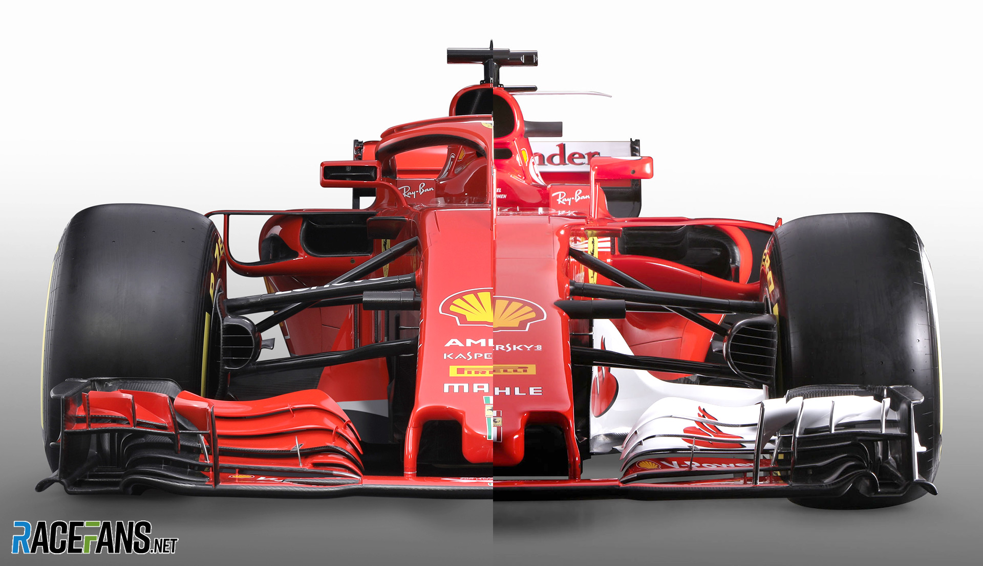
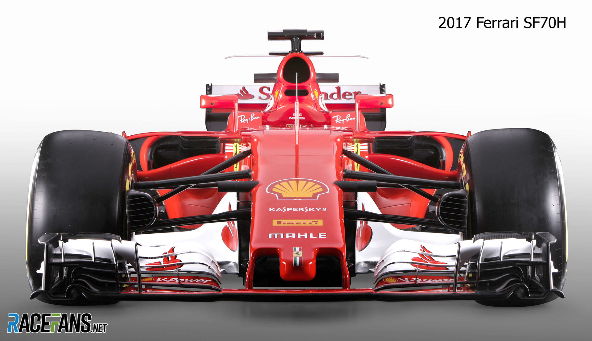
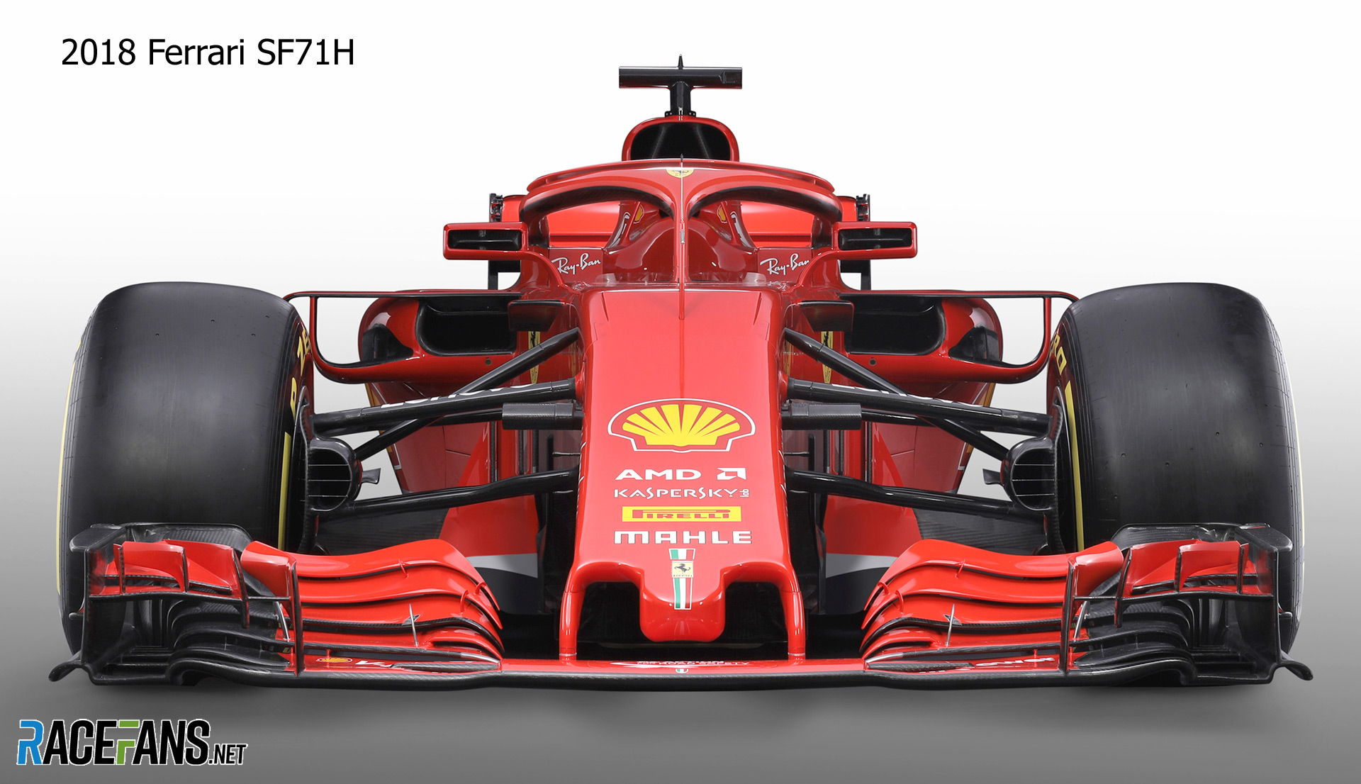
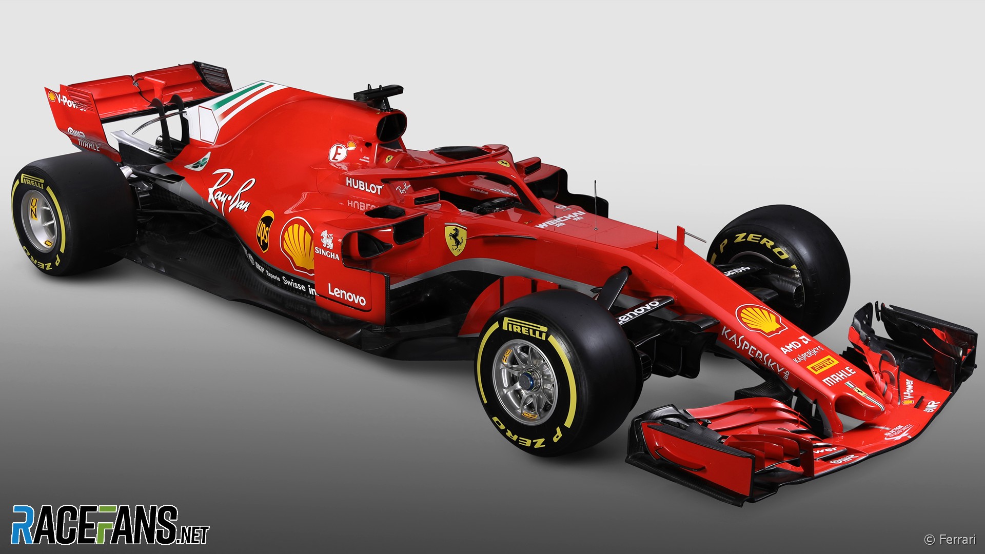
Ferrari SF71H and SF70H: Front
 ”
”
Based on the first images of the SF71H it seems Ferrari intends to stick with its tried-and-tested thumb-tip nose design for 2018. We will watch with interest to see if a new design appears during testing or at round one.
The team led the way with its sidepod and radiator inlet design last year and this part of the car is clearly a refinement of the previous style. The packaging has shrunk and the arrangement bears similarities to Red Bull’s layout.
Go ad-free for just £1 per month
>> Find out more and sign up
A minor but eye-catching detail can be seen on the mirrors, which appear to have been vented in some way, but more detailed images are needed to see exactly what has been done.
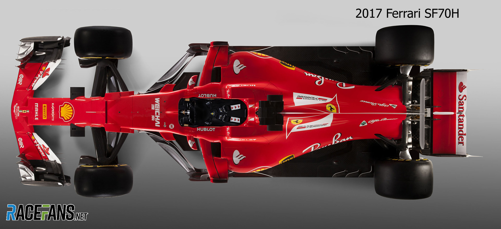
Ferrari SF71H and SF70H: Top
 ”
”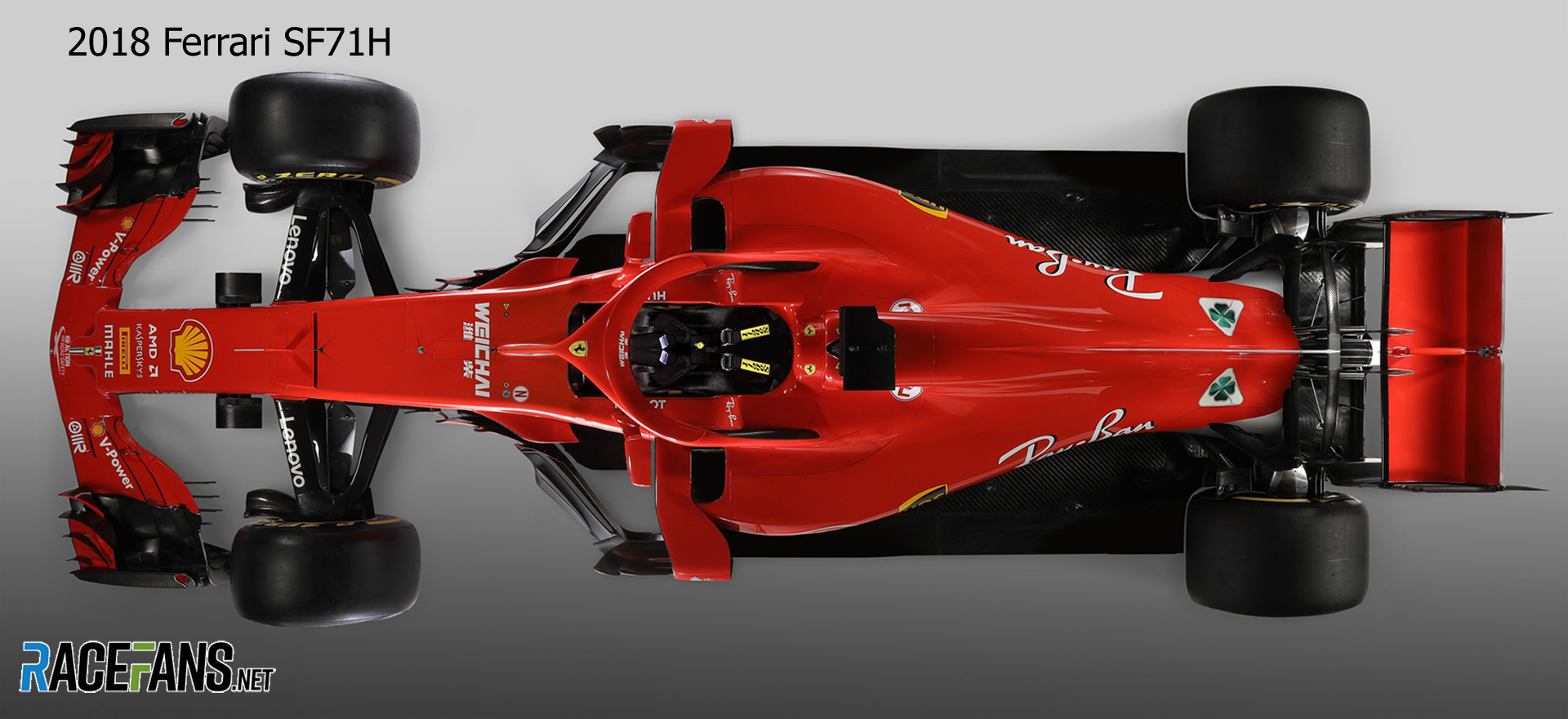
Ferrari admitted it has “slightly changed” the wheelbase on its new car compared to last year. Its SF70H was shorter than several of its rivals including, significantly, championship rival Mercedes, which had one of the longest cars. While Mercedes says its wheelbase is unchanged it appears as though the new Ferrari is longer than last year’s car.
The engine cover appears more tapered and the packaging around the gearbox tighter than before. However this is an area where Mercedes also seem to have done a lot of work – the new W09 looks very slender at the back.

2018 F1 season
- McLaren staff told us we were “totally crazy” to take Honda engines in 2018 – Tost
- ‘It doesn’t matter if we start last’: How Red Bull’s junior team aided Honda’s leap forward
- Honda’s jet division helped F1 engineers solve power unit problem
- McLaren Racing losses rise after Honda split
- Ricciardo: Baku “s***show” was Red Bull’s fault
faulty (@faulty)
22nd February 2018, 18:26
I think it’s beautiful.
Nathan Builder (@nathanbuilder)
22nd February 2018, 18:43
Man, that car is amazing looking. I haven’t liked a Ferrari since 2005, but this car is the stuff right here!
Nathan Builder (@nathanbuilder)
22nd February 2018, 18:44
It’s the white! It’s the freaking white accents (or lack thereof), and of course the sidepods are astonishing, but the livery makes it look so much better!
Mioki (@okif1)
22nd February 2018, 18:49
I see this is the most original car, at least in the visible parts. Those vented mirrors, the cooling inlets and the narrow body makes this design even more promising than last year’s. The Bargeboard concept is very similar to this year’s Mercedes so it seems that it is the way to go for the rest.
I am curious about the McLaren challenger, however I do not expect anything special compared to this beautiful Ferrari.
Captain Pie (@captainpie)
22nd February 2018, 18:54
Those sidepod intakes are tiiiiiny!
Also do I spy the Alfa cloverleaf still on there at the back? That’s interesting.
Captain Pie (@captainpie)
22nd February 2018, 18:55
Also @keithcollantine are you going to run your articles on new sponsorship again? His year it feels as though quite a few new sponsors are popping up.
pastaman (@)
22nd February 2018, 20:06
I sponsor Keith so I don’t need to see the other sponsors
RP (@slotopen)
23rd February 2018, 1:58
@captainpie
Isn’t frontal area a critical factor in drag? If the car is narrower, and the inlets smaller it should really reduce drag.
It is hard to tell from the pictures of the Merc, but it doesn’t look like they slimmed down much.
Perhaps this season will see a new favorite.
Carlitox (@carlitox)
23rd February 2018, 16:00
Exactly. Plus the idea is to throw as much air as you can to the diffuser, which is the most effective source of downforce. It’s not only that the inlets are tiny, it’s also that they’re high up and leave room for the air to circle and hit the rear cleanly. I do agree that this car looks very, very interesting from a tech point of view. If you can, go look for Scarbs analysis on this car, where he also explains the wing mirrors.
Kenny Schachat (@partofthepuzzle)
22nd February 2018, 19:02
Keith, from the top down view, it looks to me that the 2018 Ferrari has noticeably wider width between the front wheels than the 2017 car. Is the case and if so is that rule change or something unique to the Ferrari?
pastaman (@)
22nd February 2018, 20:07
I would guess it’s an artifact from the pictures not being taken from the exact same distance/angle
Sravan Krishnan (@sravan-pe)
23rd February 2018, 3:49
Exactly. Also @partofthepuzzle did you notice that it’s the exact opposite when you look at the back wheels from the same top down view? There the 2017 car seems wider. In actual face they are both of the exact same width, its just the camera angles.
Kenny Schachat (@partofthepuzzle)
23rd February 2018, 21:07
pastaman & Sravan: Thanks for the clarification.
Damon (@damon)
22nd February 2018, 19:32
I wish there was a mandatory standard for producing such presentation pictures for all teams – a unified set of perspectives with exactly specified angles and distances (and reference points for establishing these) for taking such pictures, so we could get accurate comparison pictures.
Keith Collantine (@keithcollantine)
23rd February 2018, 8:50
@damon OK now you just sound like me!
Damon (@damon)
24th February 2018, 15:01
@keithcollantine, but you’ve got a voice! Pull the strings, move the needle, make it happen!
hahostolze (@hahostolze)
22nd February 2018, 19:58
Ferrari the umpteenth car with smaller sidepods but bigger airbox than last season. Intriguing.
W (@vishnusxdx)
22nd February 2018, 20:28
I see the images are aligned at the wheels. If the wheelbase has changed, won’t that screw up the proportions of the comparing images?
W (@vishnusxdx)
22nd February 2018, 20:30
I refer of course to the image with view from the top.
MrBoerns (@mrboerns)
22nd February 2018, 20:35
On a side note, what kind of a hairbrained idea was it to call the successor of the sf17h the sf71h? I mean even for ferrari standards that is a silly concept
Jere (@jerejj)
22nd February 2018, 21:03
@mrboerns It’s ‘SF70H’ not ‘SF17H.’
MrBoerns (@mrboerns)
23rd February 2018, 13:11
While i feel stupid now, i am sure i’ve read a fair share of sf17h’s over the last season. Google image search confirms. Kind of making my point about the naming schema being confusing don’t you think @jerejj?
Jere (@jerejj)
23rd February 2018, 16:53
@mrboerns Yeah, but still, though, SF70H is the official name of the 2017 car. I don’t find this ”naming schema” thing confusing at all.
MrBoerns (@mrboerns)
23rd February 2018, 17:13
@jerejj Well,
2008 F2008
2009 F60
2010 F10
2011 150° Italia
2012 F2012
2013 F138
2014 F14 T
2015 SF15-T
2016 SF16-H
2017 SF70H
2018 SF71-H
….Compared to Williams it is
MrBoerns (@mrboerns)
23rd February 2018, 17:16
Might as well give them proper names, if you’re gonna be random about it anyways. Call them Francesca, or Mercdestroyer, or Daytona Super Leggera….
MrBoerns (@mrboerns)
23rd February 2018, 17:17
Itsy-bitsy-teeny-weeny-going-very-fast-mashiny
javier javier
22nd February 2018, 21:05
Sf70h 2017
Sf71h 2018
I dont see the problem or the sillyness
Patrickl (@patrickl)
23rd February 2018, 7:30
You mean how they increment the number every year by 1?
socksolid (@socksolid)
22nd February 2018, 23:39
The two hole sidepod looks very unique! Overall I like the look of the car although that grey/silver line extending out from under the nose looks pretty bad. All the colors and shapes in the world and they add a grey stripe…
Jon (@johns23)
22nd February 2018, 23:48
I think they’ve done a really goos job when you look at the details. Looks a lot sleeker and more refined
MarcSaunders
23rd February 2018, 0:40
Wow, you @racefans guys are incredible at the pictures comparing 17 and 18 cars. I believe ferrari has done a great job in the heat transfer devices because they have significantly reduced the cooling air intakes. I wonder why the intakes for the front brakes are so much smaller. Is there such a improvement that they only need about half the intake area of 2017 or will they have troubles by the cooling there?
Lancer033 (@lancer033)
23rd February 2018, 2:08
….or is it just launch spec to confuse other teams?
Michael (@cavman99)
23rd February 2018, 2:52
@marcsaunders, just you wait till he compares all the cars with each other! This is a great website!!