


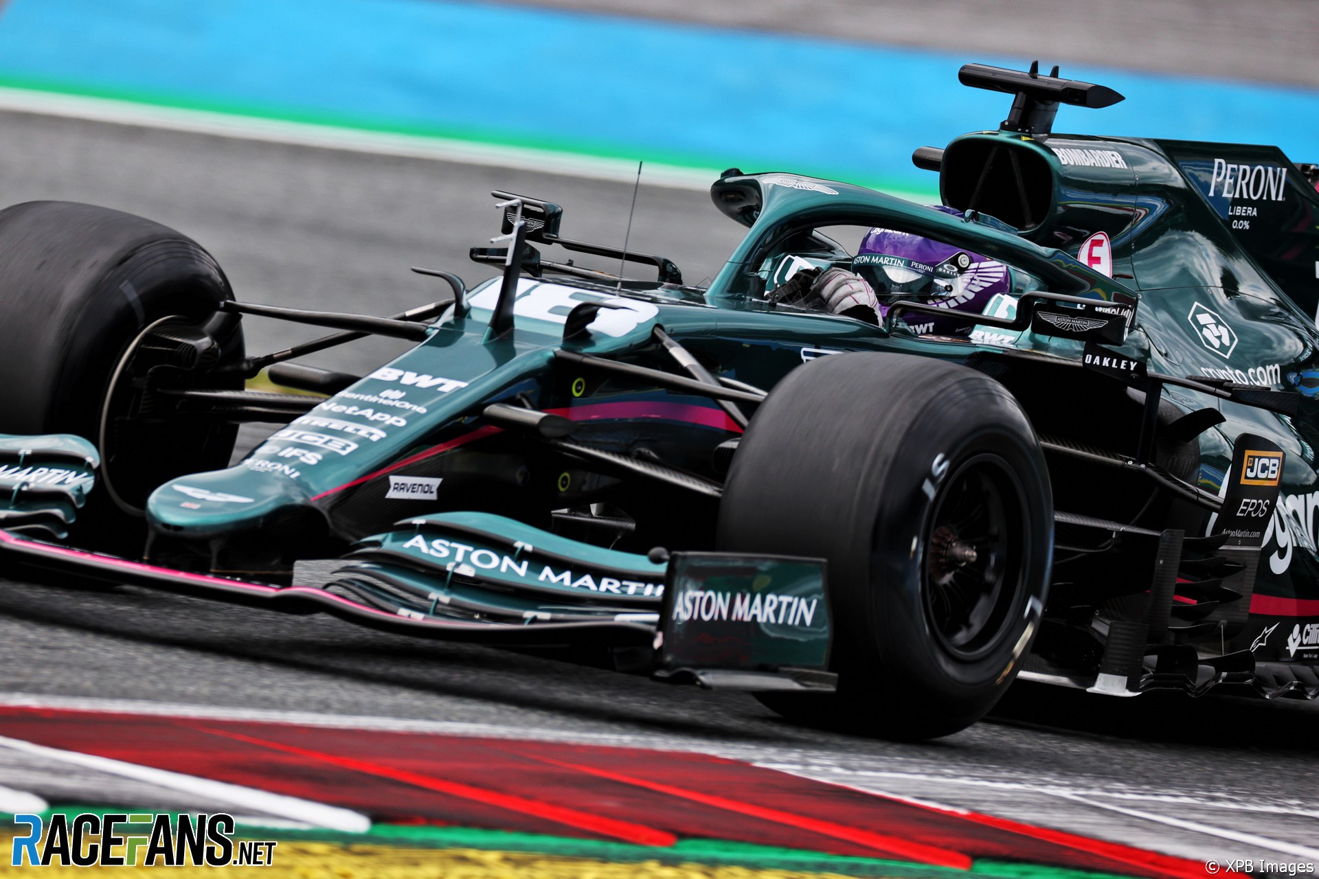
Aston Martin is considering how to improve its colour scheme so it looks better on television.
The team which competed as Racing Point last year switched to a traditional British racing green colour scheme following its rebranding. However CEO Otmar Szafnauer admits there is room for improvement in the car’s appearance in certain lights.“I think that the green colour suits us, that’s for sure,” he said. “And I think it’s a stunning colour in the sun and when you’re looking at it in person.
“I believe we should be looking at making it pop a little bit more on television without losing the green when you’re looking at it outside.”
The team needs to distinguish itself better from rival cars, some of which have also switched to darker liveries this year, such as the dark blue AlphaTauri and Alpine (formerly Renault) machines.
“I don’t know if we can do that, but that’s one thing that we’re looking to do, just to make sure that it differentiates itself on TV from some of the other darker cars,” said Szafnauer.
As Racing Point, the team previously appeared in the bright pink colour of sponsor BWT. The Austrian water company remains associated with the team, which carries a slender pink stripe on its livery, but Szafnauer said they intend to remain faithful to their predominantly green colour scheme.
“With a name like Aston Martin and Aston being green traditionally we’re growing the Aston Martin Cognizant Formula 1 team, I would think it will stay green,” he said. “Ferrari’s red, Aston will be green.”
Advert | Become a RaceFans supporter and
2021 Austrian Grand Prix
- Vasseur on Alfa’s “huge step forward” and why he’s vexed by technical directives
- How Ricciardo “got some enjoyment back” after “really low” first race in Austria
- F1’s penalty points are not “harsh” and won’t be reviewed this year – Masi
- Austrian double showed Sainz found his feet faster than 2021’s other big-name moves
- 2021 Austrian Grand Prix Star Performers
Adam (@rocketpanda)
2nd July 2021, 17:39
Why don’t they just make the green a little brighter then? Or two-tone it and add in a more electric green to contrast with the darker shade? He’s right though it looks nice in bright sun – when the green shows up well, but mostly it just looks a little too dull on television.
GongTong (@gongtong)
2nd July 2021, 20:13
@rocketpanda that’s what I thought. Aston Martin’s classic colour was sage green, wasn’t it? Although I’m not sure that would look modern enough.
Sensord4notbeingafanboi (@peartree)
3rd July 2021, 4:18
Brighter green should do it and not running a 2020 merc.
Erzen (@xenn1)
3rd July 2021, 8:54
Reminds me of the Taroco Orange McLaren (or however it was called) because the Taroco looked more like the Papaya orange on TV. This should be an option for Aston Martin as well and i don’t think it’s such a bad idea
Gusmaia
2nd July 2021, 17:50
Even simpler: racefans starts do sponsor the Aston Martin team, so they adopt the green hue we see on this site.
Steve Clark
2nd July 2021, 17:52
I’m sure it’s a difficult thing I get right for TV. I remember going to the Indy Car races in Toronto in 90’s and being so surprised that the red Marlboro Penske’s from TV were more of a dayglo bright orange than red in person.
Rhys Lloyd (@justrhysism)
2nd July 2021, 23:45
Red is a particularly difficult colour to capture and reproduce, especially on the old CRT TVs.
lubhz (@lubhz)
3rd July 2021, 8:50
When I visited the motorsport museum in Doncaster and saw the early 90s McLarens there I noticed that their marlboro red on front wings is actually pink orange when you look at it in person. (@justrhysism)
Rhys Lloyd (@justrhysism)
3rd July 2021, 10:21
@lubhz yeah you can see it’s not the right red on modern TVs which have much more accurate colour reproduction.
Pretty sure Ferrari did a similar thing with the shade of their red.
bernasaurus (@bernasaurus)
2nd July 2021, 18:02
I’ve mentioned on here before that I struggle to differentiate between a Mercedes and Aston Martin when they are coming head on to the camera. I rely on the rear of the car to tell the difference, as far as I’m aware I’m not colourblind. Lewis’ helmet, or Cognizant are usually what helps me, perhaps in person they look very different but on TV it takes me a moment or two to figure out if it’s a Merc or Aston.
Balue (@balue)
2nd July 2021, 18:12
Yeah a brighter green would be good for us watching on TV
DaveW (@dmw)
2nd July 2021, 18:12
Agree. On TV the values seem compressed. It’s often really hard to distinguish Alpine, AM, and MB sometimes. And as you say bright colors also seem to get desaturated—like all of those special hues of red Ferrari uses just don’t show well on TV. I think where it’s easier is night races, where the special paint effects the teams use look terrific.
davidhunter13 (@davidhunter13)
3rd July 2021, 7:05
Just don’t go a washed out pale green similar to the washed out pale pink they used before. Just make it bold. Make it the 7Up Jordan green. It’s not difficult.
Kyle S
2nd July 2021, 18:10
The Aston GT3 livery of Thiim/Sorensen is the example to follow.
Kyle S
2nd July 2021, 18:12
GTE*
Esteban (@esteban)
2nd July 2021, 18:23
I’d say to them try to finish in the top 3. That’ll make them look better on TV.
Jere (@jerejj)
2nd July 2021, 18:32
I don’t have an issue with the present green, so I don’t see a need for changing.
Matthijs (@matthijs)
2nd July 2021, 18:33
Well it worked for Jaguar and Lotus/Caterham, so it is possible to have a clear British Green colour on television.
bsanderson (@bsanderson)
2nd July 2021, 18:44
I think it looks great just as it is
Ben (@)
2nd July 2021, 19:15
I liked the Pink. It was distinctive. If it ain’t broken, don’t fix it.
Sensord4notbeingafanboi (@peartree)
3rd July 2021, 4:20
Me too but jaguar green was terrific.
baasbas
2nd July 2021, 19:15
I was joking when I called them pink Mercedes last year. Now I call them Mercedes only to find out I was wrong in a close up shot …
Edvaldo
2nd July 2021, 19:35
They do look terrible on TV.
A “Caterham-green” would look so much better.
Roth Man (@rdotquestionmark)
2nd July 2021, 19:56
I remember Jaguar saying this before the 2000 season. Hence why the Jags were a much brighter green.
Robert
2nd July 2021, 20:27
I have definitely mistaken the Aston for a Mercedes several times this season. But never the other way around, so that tells me the Aston is the one that needs an improvement on their identity. Funny thing is, I remember the team with Aston Martin brand representatives in particular, talking at length about how much research and development had gone into this particular shade of paint when the team was launched. I was not surprised, but a bit disappointed that it was such a dull looking green. I doubt we will see any change this season, maybe next year.
lucho19
2nd July 2021, 22:25
The deep green color is very dull to me. Plain boring. Barely identifiable. No much to see. But it is a matter of preference. Change it.
CarWars (@maxv)
2nd July 2021, 23:06
Even on track side in Austria it is hard to distinguish from the merc. Only the red top color distinguishes the cars. It’s a merc after all, guess it’s just not pink anymore..
Leroy (@g-funk)
3rd July 2021, 1:10
With the midfield as close as it is with Aston in 6th behind Alpha Tauri and with Aston promoting itself in the recent past as the best of the rest, shouldn’t they be focused on performance rather than the shade of green? Don’t get me wrong, I do think it appears too dark on TV but that seems like the least of their worries right now and probably should have been something they took into account when picking the color. They aren’t a new team and presumably have experience with understanding how the TV camera affects the color of the car so I would have thought they already knew how it would look on TV.
mantresx (@mantresx)
3rd July 2021, 2:15
I have a simple suggestion for AM or any other that really wants to differentiate from the rest: Paint all the car, all the way to the floor including wings, bargeboards and endplates.
Currently they all leave the bottom half of the car unpainted and even with a brighter green it will never really look distinctive.
juan fanger (@juan-fanger)
3rd July 2021, 5:20
A white (or pink) definition line between the green and black would really help the green to “pop”.
juan fanger (@juan-fanger)
3rd July 2021, 15:18
Or at least a thicker one. D’oh!
Patrick Poirier
3rd July 2021, 2:40
They need to replace the pink stripes with the yellow ones as originally intended – same as on the pace car. Looks awesome.
JL (@j-l)
3rd July 2021, 5:31
Make the green more classic and add some yellow. It’s not rocket science.
Dave
3rd July 2021, 8:24
Go for brighter green and spice up the design.
mrfill (@mrfill)
3rd July 2021, 12:05
British Racing Green to me is epitomised by either the Bentley’s of the 1920s or the D-type Jags of the 1950s.
The current Force Stroll incarnation is more like mouldy bread green.